How to Design Premium vs Value Packaging for Incontinence Products
The category punishes lazy packaging
Three words only.
I think most adult incontinence brands still package like procurement teams are the only audience that matters, even though the actual buying chain now runs through embarrassed self-buyers, exhausted caregivers, retail planograms, Amazon thumbnails, pharmacy shelves, and institutional reorder sheets that punish confusion faster than they punish mediocre absorbency. So why are so many packs still shouting technical nonsense while hiding the one thing the buyer wants to know: “Will this feel normal, work fast, and not humiliate me?” According to Reuters, Japan’s adult-diaper market is projected to grow 16% to 98.9 billion yen by 2027, and Daio Paper said buyers responded positively when the product no longer felt embarrassing to bring home.
I’ve seen this pattern.
Back in 2019, Reuters reported that Essity pushed TENA toward younger consumers with Silhouette Noir, a black low-rise disposable underwear line, while company leadership said packaging had to feel discreet and gender-aware; usage in France and the UK among the target adult female audience rose from roughly 13% to closer to 20% in five years. That is not a cute branding anecdote. That is a packaging-and-positioning lesson with money attached. Do you still think the bag is just a bag?
And here’s the hard truth.
Incontinence is an “embarrassing product” category in the classic marketing sense, which means discretion is not optional polish but part of the buying mechanism itself; Wharton’s analysis made that point years ago when it described how shoppers try to buy products like adult diapers without being exposed socially. I do not care how advanced your SAP core is if the front panel makes the shopper feel 20 years older in aisle seven. Who exactly do brands think they are selling to?
Table of Contents
Premium vs value is not pretty vs cheap
This is the split.
Premium incontinence packaging is a higher-trust, lower-friction system built to defend price, reduce embarrassment, and signal consistency before the bag is even opened; value packaging is a leaner system built to protect price-per-unit logic while preserving legibility, compliance, transport integrity, and reorder clarity. The difference is not “gold foil versus plain film.” The difference is what kind of risk you ask the pack to absorb. Isn’t that what real packaging strategy is supposed to do?
I’m blunt about this.
If you are selling a premium line, the pack must carry emotional labor: softer color control, quieter material cues, fewer screaming claims, stronger hierarchy, and an “underwear” or “daily confidence” mental model for ambulatory users. If you are selling value, the pack must carry economic labor: count architecture, clean size coding, fast scan recognition, stronger case-pack logic, and zero room for mis-picks in retail or institutional replenishment. Miss that split and you get the worst outcome in the business: a cheap-looking premium SKU and an overdesigned value SKU. Why pay for confusion twice?
I would tape that table to the wall of every product meeting, because it forces the adult diaper packaging design debate back into operations, margin, and shopper psychology instead of the usual empty argument about whether matte pouches “feel more premium.” They do, sometimes. But only when the rest of the system makes sense. Otherwise it is just expensive confusion.
The compliance angle most packaging teams underweight
This matters legally.
In the U.S., the FDA device listing database classifies adult diapers, disposable underwear, incontinence pads, and incontinence sheets under Product Code EYQ, Device Class 1, Regulation 21 CFR 876.5920. That alone should end the lazy habit of treating incontinence product packaging like a decorative afterthought, because the category sits much closer to regulated performance communication than a casual lifestyle accessory does. Still want to improvise claims language?
And then there is human factors.
The FDA’s human factors guidance says usability engineering should reduce use errors, improve understanding, and reduce reliance on manuals; the agency’s human-factors overview also spells out that the user interface includes unpacking, setup, and maintenance interactions. I read that and hear one thing: your pack is part of the device experience. If the size code is weak, the absorbency tier is vague, or the opening method is annoying, you did not just design bad packaging. You designed avoidable user friction. Why pretend otherwise?
I’m even harsher here.
Value packs especially cannot hide behind “budget positioning” to excuse sloppy architecture. A value SKU with weak legibility causes wrong-size purchases, returns, caregiver frustration, and warehouse errors. A premium SKU with overpromising language invites mistrust. Different sins. Same damage. That is why I would always tie front-of-pack decisions to the supplier’s OEM/ODM services for adult incontinence products and the site’s adult diaper test reports and certifications before approving print. If the spec file, test file, and pack file are not talking to each other, your “brand strategy” is just theater.
How I would design premium packaging for incontinence products
Make it quieter.
Premium packaging for adult diaper packaging design should reduce shame without becoming vague, which means clear absorbency architecture, but expressed in a restrained visual system: midnight blue, charcoal, muted teal, or soft neutrals instead of nursing-home beige or panic-sale red; one hero claim, one support claim, one proof point; and enough white space that the pack reads as deliberate rather than desperate. Does every panel need to scream? No.
Build around use case.
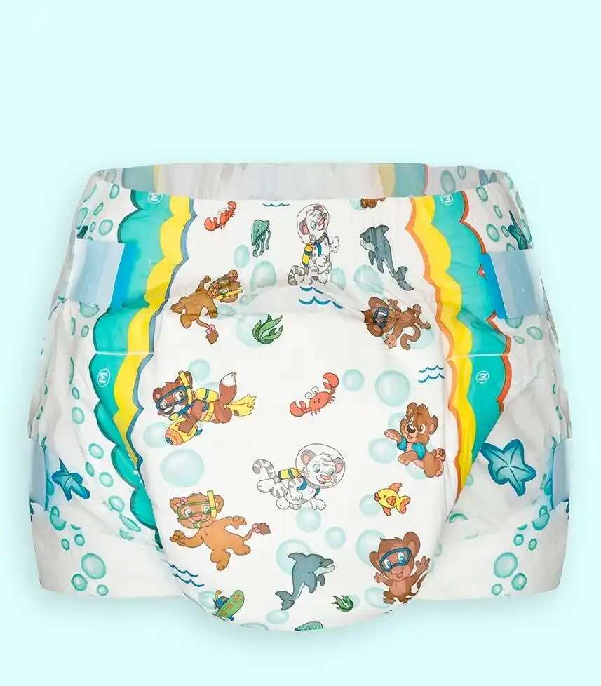
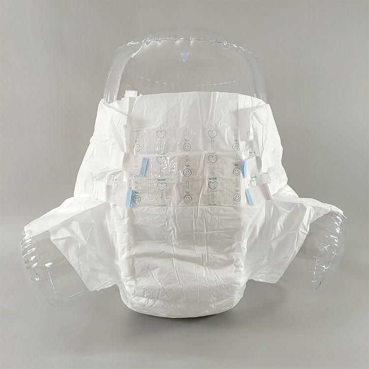
For pull-up underwear, I would frame the pack around independence, discretion, quiet materials, and day/night occasion language, because the site’s bladder control pull-up underwear for adults already leans into soft, quiet, underwear-like cues and OEM pack customization. For tab briefs, I would shift to caregiver workflow, overnight reliability, and heavy-output control, because the adult diapers with tabs for heavy care page clearly positions that format for standing, sitting, or lying changes in hospitals, nursing homes, and home care. Why package both formats with the same emotional message when the usage logic is different?
I would also spend the money.
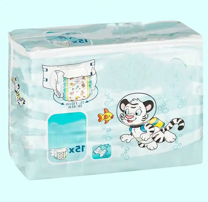
Not on gimmicks. On the right details. Softer hand-feel film. Lower-crinkle structures. Better zipper or easy-open tear control where the channel supports it. Cleaner side-panel icon systems. Fewer front-panel bursts. Better size diagrams. A premium line can justify a 12-count, 14-count, or 16-count bag if the pack earns trust and protects margin, especially in pharmacy and e-commerce where the thumbnail and the first tactile contact matter more than most packaging teams admit. Is a shopper paying only for absorbency? Of course not.
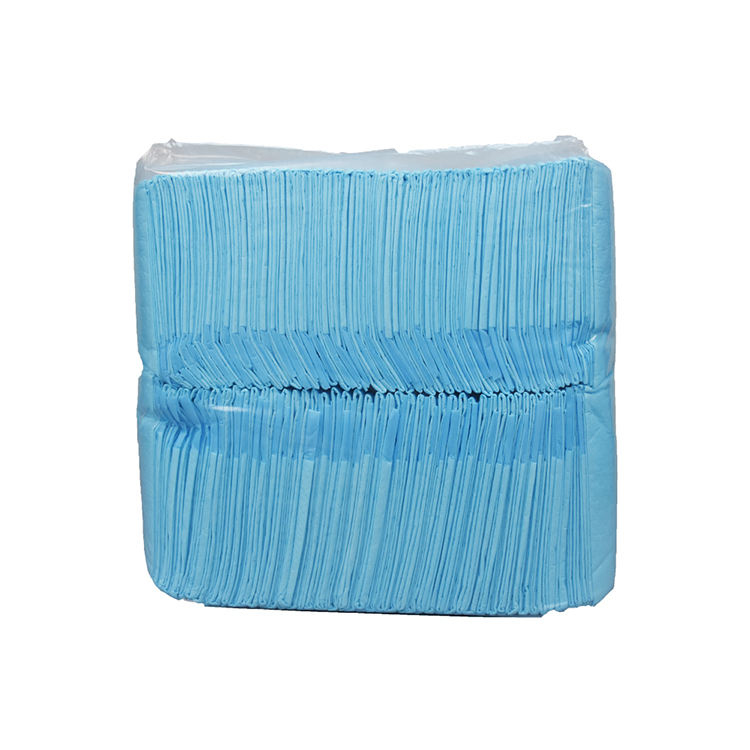
How I would design value packaging without making it look disposable in the wrong way
Keep it ruthless.
Value packaging for incontinence products should not chase elegance first. It should chase comprehension first. Large absorbency bands. Bigger size markers. Hard-to-miss count callouts. Obvious day versus overnight separation. Fewer shades. Stronger SKU coding. Standardized case-pack language. If I need three extra seconds to understand the pack, the pack already failed. Isn’t value supposed to save time too?
But do not get cheap in the wrong places.
I hate when brands cut film gauge, compress pack readability, and then wonder why complaints rise. The site’s recent piece on underpad backsheet materials by channel makes the broader point well: materials choices change noise, feel, microclimate, and complaint rates, and cheap “waterproof” is not a strategy by itself. The same logic applies to value adult diaper bags. Strip cost from decorative excess, yes. Strip cost from seal integrity, handle durability, or legibility, and you are just moving expense downstream into returns and angry emails. Smart savings or fake savings?
Channel decides the pack.
The site’s briefs vs pull-ups by channel and incontinence underwear vs briefs SKU strategy both get one thing right: packaging architecture should change by pharmacy, institution, e-commerce, club, and export. Pharmacy wants simple and discreet. Institutional wants fast reorder logic. E-commerce wants expectation control to avoid 1-star reviews and RMAs. Club wants price math. Export wants localized claims and consistent carton marks. So why do some brands still build one global bag and hope for the best?
The pack architecture I would approve today
Here is my bias.
For premium pull-up underwear packaging, I would approve: soft-touch visual language, restrained front panel, one absorbency icon, one silhouette visual, one discreet confidence claim, a clear waist-size range in both inches and centimeters, and a bag count that protects premium ASP instead of chasing warehouse volume.
For value pull-up packaging, I would approve: larger count, louder size coding, stronger absorbency stripe, simplified front art, obvious per-unit economics, and a brutally clear use-case line such as “Moderate Daytime Leaks” or “Overnight Heavy Protection.”
For premium tab-brief packaging, I would approve: caregiving cues without looking institutional, clearer refastenable-tab messaging, fewer but stronger proof claims, and side-panel fit instructions that respect the user’s dignity.
For value tab-brief packaging, I would approve: count and size dominance, stronger case-pack standardization, warehouse-friendly barcoding zones, and no fashionable nonsense whatsoever.
That is the split I trust. Not because it sounds nice. Because it matches how people actually buy.
FAQs
What is premium packaging for incontinence products?
Premium packaging for incontinence products is a higher-spec pack system that uses stronger material choices, cleaner hierarchy, quieter visual language, better tactile cues, and sharper use-case communication to justify higher pricing, reduce embarrassment, and improve trust across pharmacy, e-commerce, home-care, and specialty retail channels.
I would add one hard rule: premium should feel calmer, not busier. When premium packs start adding five extra claims and metallic clutter, they stop looking premium and start looking insecure.
What is value packaging for incontinence products?
Value packaging for incontinence products is a cost-disciplined packaging system designed to maximize count economics, legibility, warehouse accuracy, and reorder speed while still preserving seal integrity, regulatory clarity, absorbency communication, and enough shopper confidence to avoid returns, substitutions, and avoidable complaints in retail or institutional channels.
My view is simple. Value does not mean ugly. It means nothing on the pack gets a free ride.
How should adult diaper packaging design differ for briefs vs pull-up underwear?
Adult diaper packaging design should separate briefs and pull-up underwear by user workflow, not just by absorbency, because pull-ups sell independence, normal-underwear cues, and discreet self-selection, while briefs sell caregiver efficiency, heavy-leak control, refastenable application, and clearer bed-care or overnight positioning across pharmacy, e-commerce, and institutional channels.
If a shopper can confuse one for the other at a glance, the packaging team has already created future returns.
Why does compliance matter in incontinence packaging design?
Compliance matters in incontinence packaging design because adult diapers, disposable underwear, incontinence pads, and sheets sit inside a regulated product environment where labeling clarity, intended-use communication, user comprehension, and documented performance support can affect purchasing decisions, use errors, complaints, supplier audits, and the brand’s exposure when claims outrun proof.
This is why I never separate pack copy from test reports. Ever.
Premium should signal dignity. Value should signal control. And both should signal competence. If your current incontinence packaging design cannot do all three, then the problem is not the printing vendor. It is the strategy.